Claim submission App
HealthEquity, mobile app
The HealthEquity mobile app allows employees to submit medical receipts for reimbursement from their Health Savings Accounts (HSA), Flexible Spending Accounts (FSA), and other pre-tax benefit programs. The current process requires multiple manual steps to upload receipts, input details, and submit claims. This results in a cumbersome user experience, contributing to delays and user errors.
My Role
Product designer
Product strategy
UX researcher
Interaction designer

Problem
Inefficiencies and frustration in Claim Submission Process
The original HealthEquity claim submission process was cumbersome and time-consuming, requiring users to manually input claim details and complete multiple steps just to upload medical receipts. This slow process for categorizing receipts, coupled with limited assistance in claim validation, often resulted in errors and delays. As a result, users faced frustration, longer submission times, and reduced efficiency in managing healthcare reimbursements.

Solution
Accelerating claim submission through camera and AI integration
During the design phase, I brainstormed the overall architecture to create a faster, AI-driven experience. By focusing on integrating the phone’s camera scan functionality, I streamlined the process, allowing users to capture and submit receipts directly. This approach, powered by AI/ML capabilities, reduces the number of steps required to file a claim, enhancing both speed and user convenience in the submission process.

Intelligent document scanning
To improve submission speed and accuracy, I incorporated an intelligent document scanning feature into the app. Utilizing advanced machine learning, this functionality enables users to easily scan their receipts with their phone's camera. The system efficiently extracts information from the document, automatically populating required fields with accurate details and significantly reducing the likelihood of errors.
Streamlined submission process
I redesigned the process flow by focusing on minimizing unnecessary steps, the redesigned interface now requests only essential inputs from users while automatically extracting the rest from the scanned documents. This approach simplifies the process and makes claim filing faster and more intuitive, allowing users to complete submissions with minimal effort.

Modular system to bring it all together
I established the design system and principles for the entire platform to create a consistent experience for our users. This was essential to build trust, reliability, familiarity and connect multiple products. It was created in collaboration with engineering to ensure efficiency in development as the platform evolves with growing needs.

Take Aways
User Insights for Growth
The redesign provides a faster, more accurate claim submission process, saving users time and reducing the potential for human error. Initial user testing showed
Claim submission time
50%
of users saw reduced claim submission time by 50%
Behavioral Impact
75%
Fewer errors in submissions, leading to faster claim approvals.
Next Project
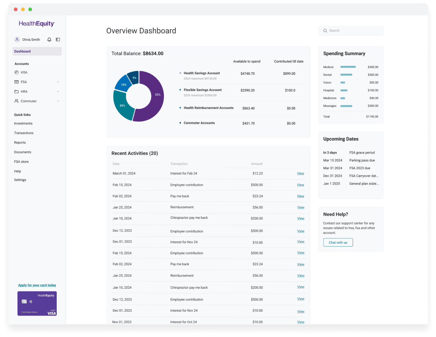
HealthEquity - Web
HealthEquity - Web
Claim submission App
The HealthEquity mobile app allows employees to submit medical receipts for reimbursement from their Health Savings Accounts (HSA), Flexible Spending Accounts (FSA), and other pre-tax benefit programs. The current process requires multiple manual steps to upload receipts, input details, and submit claims. This results in a cumbersome user experience, contributing to delays and user errors.
My Role
Product designer
Product strategy
Market research
Prototyping


Problem
Inefficiencies and User Frustration in Claim Submission Process
The original HealthEquity claim submission process was cumbersome and time-consuming, requiring users to manually input claim details and complete multiple steps just to upload medical receipts. This slow process for categorizing receipts, coupled with limited assistance in claim validation, often resulted in errors and delays. As a result, users faced frustration, longer submission times, and reduced efficiency in managing healthcare reimbursements.


Solution
Accelerating Claim Submission Through Camera and AI Integration
During the design phase, I brainstormed the overall architecture to create a faster, AI-driven experience. By focusing on integrating the phone’s camera scan functionality, I streamlined the process, allowing users to capture and submit receipts directly. This approach, powered by AI/ML capabilities, reduces the number of steps required to file a claim, enhancing both speed and user convenience in the submission process.


Intelligent Document Scanning
To improve submission speed and accuracy, I incorporated an intelligent document scanning feature into the app. Utilizing advanced machine learning, this functionality enables users to easily scan their receipts with their phone's camera. The system efficiently extracts information from the document, automatically populating required fields with accurate details and significantly reducing the likelihood of errors.
Streamlined Submission Process
I redesigned the process flow by focusing on minimizing unnecessary steps, the redesigned interface now requests only essential inputs from users while automatically extracting the rest from the scanned documents. This approach simplifies the process and makes claim filing faster and more intuitive, allowing users to complete submissions with minimal effort.


Modular System to bring it all together
I established the design system and principles for the entire platform to create a consistent experience for our users. This was essential to build trust, reliability, familiarity and connect multiple products. It was created in collaboration with engineering to ensure efficiency in development as the platform evolves with growing needs.


Take Aways
User Insights for Growth
Incorporating user feedback throughout our design process helped us get a better understanding of current gaps, needs to create efficient workflows. Investing time and resources in foundational efforts and a design system are critical to ship efficiently, faster without sacrificing on quality.
Claim submission time
50%
of users saw reduced claim submission time by 50%
Behavioral Impact
70%
Fewer errors in submissions, leading to faster claim approvals.
